Sunday 24 March 2013

FFC04


The latest Festive Friday Challenge is to make a card based on the trigger word "merry", so using my merry die to make a negative die cut was my jumping off point. This challenge seemed to be calling out to me for bright colors, so I used some primary colors, which is not my usual style, and added a festive string or two of Christmas lights. I adore this seldom used set, and the little bulbs look so realistic, especially if you add a coat of clear glass finish on top.

A side view gives a better look at the negative die cut and the glassy bulbs.


Thanks for stopping by. I'm on hiatus this week for a Spring Break ski trip, so see you soon,
T

Supplies
PTI: white cardstock, merry and bright set, wonderful words: holiday set and die
SU: poppy parade cs, poppy parade, daffodil delight, ballet blue and wild wasabi inks
Other: clear glass finish Liquid Embossing, foam tape

Saturday 23 March 2013

Muse Challenge #9


It's my favorite time of the week, Muse challenge day! I usually avoid posting challenges at the last minute, but I kind of like spending Saturday morning writing my post, looking at all the other links, and voting on my favorites while sipping on coffee. Much more relaxing than my usual midnight posts!

This week's muse, Marion Vagg, provided us with gorgeous inspiration. I loved the white embossing, and the blues, so I pulled out some of my favorite retired blues from SU. Why are they retired? They don't look tired at all. They're fresh as a daisy. I know, cheesy, but seriously, I really miss these colors so really enjoyed playing with them.

Here's Marion's inspiration card:


Thanks for stopping by,
T

Supplies
SU: tempting turquoise, ballet blue, brilliant blue and cool Caribbean cardstock, mixed bunch flower stamp, 3/8" circle punch, white craft ink,
PTI: white cardstock, signature greetings II
Other: detail white embossing powder, smooch pearlized top coat

Thursday 21 March 2013

CFC94: Chipboard


I didn't happen to have any chipboard for this CAS-ual Fridays challenge, but I pulled the top off this fantastic blue-green metallic Kleenex box and thought that it would make a beautiful vase. The other layers were cut from an empty Lindt chocolate bar box. I always seem to have one or two of those on hand, and if I don't have an empty one, well that is sacrifice I am willing to make for my craft!

Here is a close-up in the window this morning to get a better look at the colors without the glare of the flash.

I think I will have a lot more shiny blue die cuts in the near future. Just need to empty this box!
Thanks for stopping by,
T

Supplies
SU: island indigo cs and ink, wild wasabi cs and ink, real red ink, blender pens, not quite navy marker, simply soft stamp
PTI: white cs, gracious vases die, happy harlequin sentiment
Other: twitterpated dp, sepia versafine ink, rhinestones, foam tape, smooch pearlized topcoat

Sunday 17 March 2013

OLW 131


Happy St. Patrick's Day! Just got home form the Great Big Sea concert, so finally have a moment for a quick post. This week's One Layer Wednesday Challenge was to make a card in the colors of the Irish flag - green, white and orange. It's difficult to see in this photo, but I embossed a line above the circles, and a double line below as a subtle border between the images and sentiment to make it look a little more "finished". Also, the spring moss looks a little washed out here. Wish I'd had more time to get a pic when it was still light out. This looks so much nicer in person. It seems to me most cards do to some degree. I guess I'm not destined to become a professional photographer!

I'm exhausted, so off to bed. Have a great week!
Thanks for stopping by,
T

Supplies
PTI: white cs, spring moss ink, edger die, thank big favorites sentiment
SU: serene silhouettes, tangerine tango and old olive inks

Saturday 16 March 2013

Muse Challenge #8


I almost ran out of time to play along with Muse this week, but managed to squeeze it in at the last minute, though the cat tried every trick in her book to stop me, including the dreaded ribbon attack!

Don't ask me why this card is so symmetrical. Not usually my style. I broke out the rhinestones to add an element that wasn't centered, but once I added one, the other side was crying for some bling. Oh, well. I guess it's good to change it up now and then. I didn't accomplish the goal to use something previously unused today, but I think symmetrical is previously unused by me, so I'm going to roll with it! It's hard to tell from this photo, but I popped up the banner in the middle, as well as the flower.

Here is the beautiful inspiration card made by Therese.

Thanks for stopping by,
T

Supplies
PTI: white and limeade ice cs, mega mat stack 3 die, photo finish strip die, flower fusion 2 die, beautiful butterflies sentiment, plaid impression plate, rhinestones
SU: pacific point cs, espresso ink, button and twine, striped texture folder, blossom punch
Other: foam tape

Thursday 14 March 2013

Make it Monday #107


Clear cardstock and Copics?! Sounds like too much fun to pass up on, so a quick card and a quick post. Well, the coloring wasn't that quick. Those poppies are pretty small, especially the stems, but I had lots of time to color while watching Idol. I even tried stamping them horizontally and colored those, and I liked that panel too, so I made a second card. I couldn't decide what sentiment I should use, so left it blank. I may just wait and see what I want to use it for and add something then.

Thanks for stopping by,
T

Supplies
PTI: clear, white and simply chartreuse cardstocks
SU: pleasant poppies, teeny tiny wishes, word window punch, pool party ink, poppy parade cs
Other: sepia versafine ink, copics, crop-a-dile, ribbon

Sunday 10 March 2013

CTS#18/CFC#93


I can't believe I'm combining challenges twice in one week, but CAS(E) this sketch! and CAS-ual Fridays played equal parts in inspiring this card. I'll show you what I mean. Here is the sketch that started it off:
Super cute, right? I just had to turn it on it side to make room for this sentiment, which would have been a bit of a tight fit in a portrait format, and leave a spot for the cute little baby feet.

Here's the second part of my inspiration:


I applied color blocking to my sentiment to make the negative die cut really stand out. Usually, when I do color blocking, I gravitate to more bold colors, but decided to change it up today and do a baby card in softer colors. I guess it seemed appropriate for the spring weather.

I hadn't used this die before, and this is a great way to use up cardstock scraps, so I'm satisfied that I accomplished something besides just making a cute baby card. That's it for this week. I think I need to pause for a day or two and clean up my craft disaster area!

Thanks for stopping by,
T

Supplies
PTI: kraft and rustic white cardstock, wonderful words die
SU: dotted scallop ribbon border punch, white craft ink
Misc: stampcraft baby feet stamp, detail white embossing powder,  1/8" white satin ribbon, various cardstock scraps

Friday 8 March 2013

10 Min. Craft Dash #13

Time for another 10 Min. Craft Dash. You should really try this, it's a lot of fun. It's also stressful, but only for 10 minutes, then you can laugh about it after the fact! You should also check out the other cards posted, because some of the more brave (or crazy?) participants also include a video on their post. Too funny. Glad to see I'm not the only one that has a few mini panic attacks throughout the 10 minutes.

Onto the business at hand. Here is this week's theme:
CD_13

Awesome. Earthy is right up my alley, so I was feeling somewhat at home to begin with. In fact, I was wearing these colors when I read about the challenge! Just had to think of an idea. Something simple with alot of punch. In fact, why not something with a punch, which makes every project quicker and easier? So does patterned paper, and I don't use it often enough, so that was my starting point.

This one actually went much smoother than my #12 attempt, right up until the end. You can't believe how long it takes to tie a bow with a stopwatch running! I probably should have finished in 8 minutes, but the stopwatch says 9:17. Oh, well. A little faster than last week, and this card is a bit more complicated, and I like it a whole lot more, so that's a win in my books.


Thanks for stopping by,
T

Supplies used
PTI: kraft cardstock, think big favorites sentiment
SU: limeade patterned paper, espresso twine, basic brown ink, blossom punch
Other: Sizzix diagonal texture plate, button, foam tape

Thursday 7 March 2013

Muse7/Mojo283


I'm not generally a fan of combining challenges, but these two were meant to be together. When I looked at the Muse Challenge #7 photo, I was immediately drawn to the colors and wanted to apply them to a different layout. I was also drawn to the Mojo Monday 283 sketch and could picture them working very well together.

Anyone that has been following along with me will already know that I have a goal to include at least one unused craft supply in each project I post. Today it is PTI clear cardstock. I have used some small pieces here and there, but have been wanting to use a much larger piece as an overlay or as my card base. Today, I'm using it as the card base, with a slightly smaller kraft panel over top. I'm loving the color of this PTI kraft cardstock. I've used SU's in the past, but I find it a little more grey in tone, and I refuse to buy anything called Crumb Cake. Just kidding. I do have an ink pad, but I'm still going to call it kraft as a matter of principle, and I'm tempted to relabel it with a Sharpie! Anyway, the PTI kraft is lovely, especially when paired with white. I stamped the beautiful outlined flowers from SU's Fabulous Florets with white craft ink, and did the same on the back of a second kraft panel to adhere inside the card so the flowers would be seen on the back through the clear layer.

I don't think I had used my PTI Melon Berry patterned paper before either, so score 2 for me! I didn't have a black patterned paper on hand, so I dug up a scrap of plain black from my Scrap-folio and embossed a lovely pattern from Martha Stewart on it in detail white. I assembled the 3 cardstock pieces, then cut a window out with a Nestabilities circle die, so that the sentiment on the inside would be visible through the clear window. I had to run it through the Cuttlebug several times in order to cut through the area where all 3 colors overlapped. I embossed the larger flower with white on Melon Berry cs, and the leaf on black and fussy cut them all out, then adhered the pieces to the front of the clear cs.

I could have just stamped the sentiment directly on the cardstock panel adhered inside the card, but I thought it would be better to have a panel and circle in 2 different colors so it would be easy to see when writing on the inside, where to avoid writing so it isn't visible from the outside. I cut a slightly larger white circle with the next size Nestabilities die, and stamped "Love You" from Script Sentiments in Basic Black ink.

Hope you like it! In case you feel like playing along, here is Laurie Willison's simply beautiful inspiration card, as well as the creative Mojo Monday sketch designed by Carole Burrage.
IMG_9332


Thanks for stopping by,
T

Wednesday 6 March 2013

FFC03


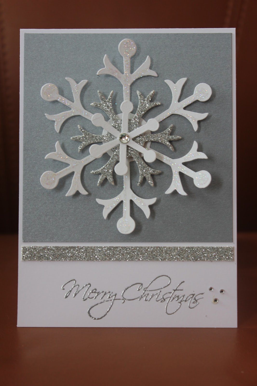
It's Festive Friday time again. This week's challenge was to incorporate a snowflake into your design. The challenge photo of a beautiful snowflake inspired me to pull out my Snow Flurry die to make a large glittery flake as the focal point, and keep the rest of the card somewhat simple.

Here is the inspiration for this project:


I ordered this snowflake die from SU before Christmas but didn't get a chance to use it, so am very pleased it's not sitting around collecting dust 'til next Christmas! I also used SU silver cs and rhinestones, PTI white cs, silver glitter paper from Michaels, versamark and detail silver embossing powder, and a sentiment stamp from Hobby Lobby.

Thanks for stopping by,
T

Tuesday 5 March 2013

CFC92


CAS-ual Friday Challenge #92 was to stamp a background as the base of your project. I am on a mission at the moment to challenge myself to work as many unused stamp supplies as possible into the projects I post, so I pulled out the patterned strip from SU's Summer Silhouettes set. I don't know why I haven't used it yet. It's pretty, but I've never felt inspired to use it with the floral stamps in that set. I thought it would be perfect for this challenge, so I stamped it repeatedly in Concord Crush ink to make the background. I added a strip of PTI's Winter Wisteria to emboss the sentiment from Happy Harlequin on, then punched out a 1-3/4" window for the circular focal image from SU's Serene Silhouettes (also previously unused!). It was stamped on the white card base with PTI's Limeade Ice, and topped off with some 1/4" white satin ribbon and a tiny bow. The patterned panel was popped up with foam tape.

Thanks for stopping by,
T

Saturday 2 March 2013

10 Min. Craft Dash #12

I was at a loss for an idea to participate in the 10 Minute Craft Dash until I saw the layout sketch for this week's CAS(E) this sketch! challenge. I thought it looked like it could be pulled of in less than 10 minutes. Just barely! 9 min. 33 sec. I didn't time myself for the more complex version I made for that challenge. I'm sure it took at least 3 times that long.
 
Here is the color scheme for this challenge:
CD_12
 
I thought I'd better keep it pretty simple since I've never attempted this before. Hopefully with a little practice I can work my way up to something a little more complicated. Here's my "masterpiece".
Oh, well.

Thanks for stopping by,
T

Supplies
PTI: white and hawaiian shores cs, kraft button
SU: teeny tiny wishes, soft suede and melon mambo cs, soft suede ink
Other: Sizzix daisies #2 die, hemp twine


CAS(E) this sketch! #17

I've been loving the Muse challenge the last few weeks, so decided to tackle this week's CAS(E) this sketch!, too.

I know. I'm really not thinking outside the box, at all, on this one. I couldn't help it. As soon as I looked at the sketch, I saw this card in my head and couldn't get it out, so I just went ahead and made it. That's OK, afterall, it is called CAS(E) this sketch! I love this layout so I traced the cut-outs so that I'd have a template if I needed it another day for a quick card. Still stuck on this color scheme from my Muse card yesterday, so ran with that, too. Here is the inspiration sketch:

Who knows, maybe I'll be inspired to do something a little more original tomorrow?
Thanks for stopping by,
T

Supplies
PTI: white, limeade ice, and aqua mist cs, ocean tides ink
SU: baja breeze cs, kiwi kiss corduroy button, teeny tiny wishes
Other: Sizzix daisies #2 die, scotch foam tape

Muse Challenge #6

It's time for another Muse Challenge! Don't ask me why I waited all week to get around to making this card. I knew exactly what I wanted to do as soon as I saw the gorgeous inspiration card by Deanna Jean. Her striking card had an interesting doodled frame that really reminded me of Spellbinders' deckled rectangles, so I thought I would use that for my frame and follow her layout, but change up the flowers. Ever since I bought PTI's Limeade Ice, I've been dying to pair it up with Ocean Tides, and this seemed to be the perfect opportunity.


I don't think this picture is really capturing the textures and colors that well. Maybe I'll try to get a daylight shot in the morning and update this post. I popped up the frame and flowers, and added a diagonal impression underneath the deckled rectangle to highlight it a bit. I also added some felt and buttons to the flowers to give them a lot of dimension.

Update: Here is a daylight shot. Much better for capturing the texture. If only I didn't spend most of the daylight hours at work during the winter!

 (Question, for future reference: Does any know what would happen if I removed the previous picture? That was the one selected when I linked to the challenge page, so would the thumbnail disappear?)

Here is the Muse card that was the inspiration for this project. Gorgeous, right?


Well that was a fun challenge! Here's hoping next week will be similarly fantastic.
Thanks for stopping by,
T

Supplies
PTI: white, limeade ice, aqua mist, simply chartreuse and ocean tides cs, ocean tides felt, flower fusion 2 and notched flower dies, beautiful butterflies sentiment
SU: baja breeze ink and cs, little leaves sizzlit die
Other: Spellbinders deckled rectangles, Fiskars diagonal texture plate, buttons, bakers' twine, Scotch foam tape